Sabika Jewelry
BRAND IDENTITY / EDITORIAL
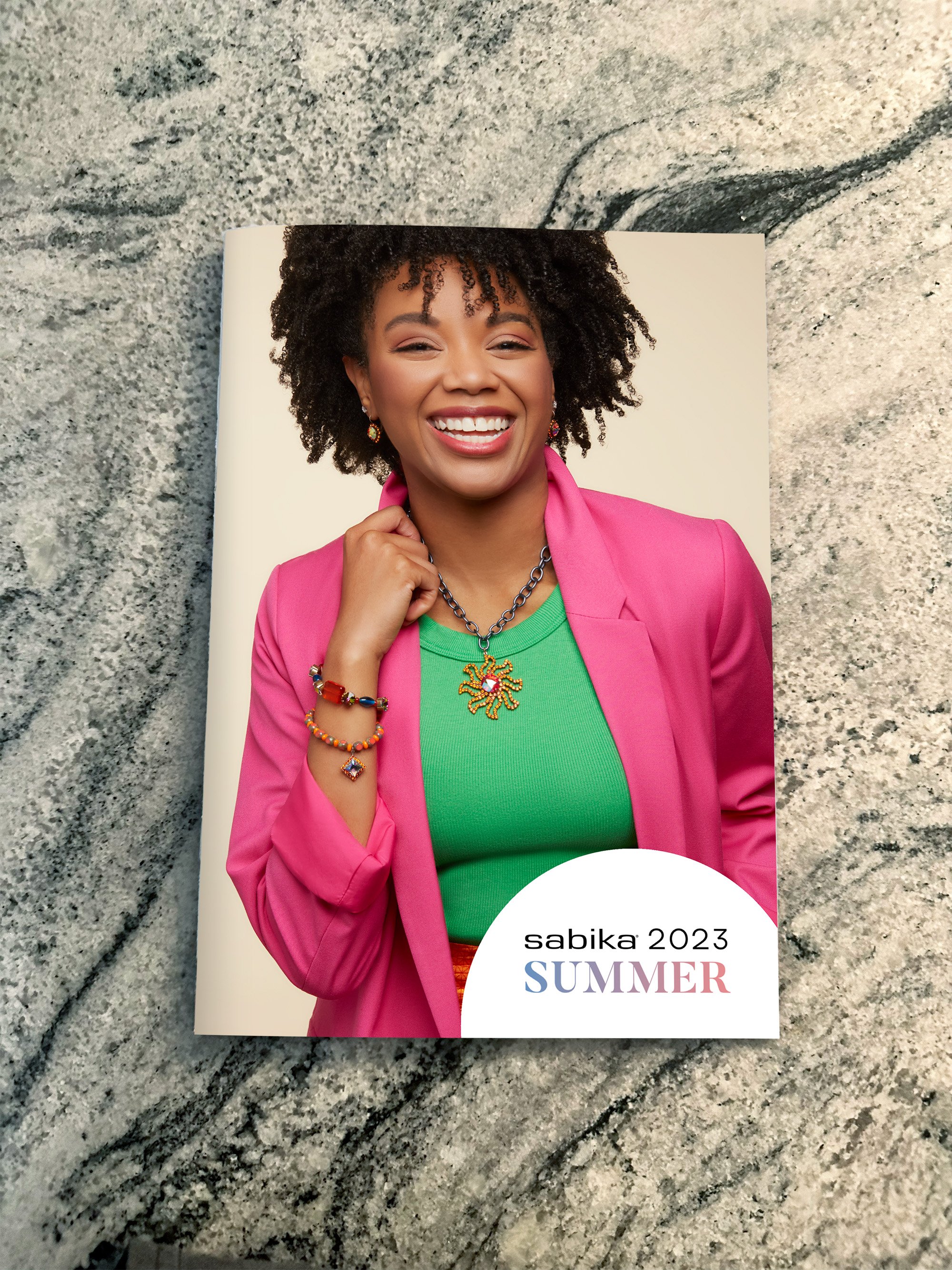
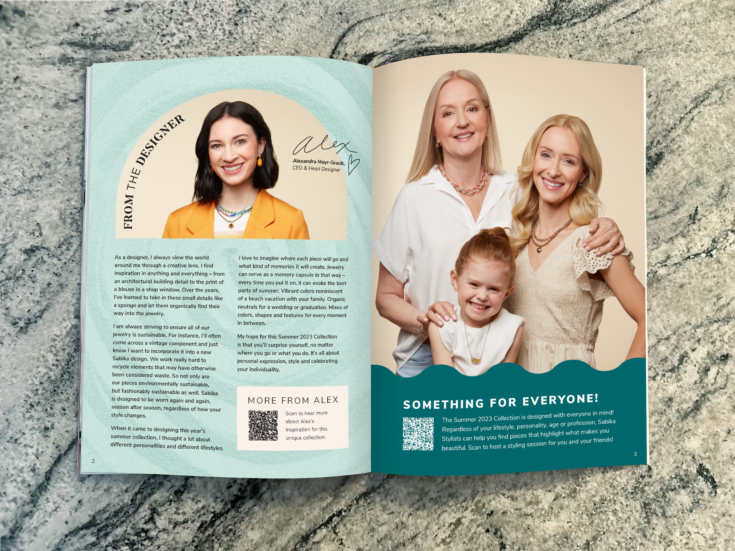
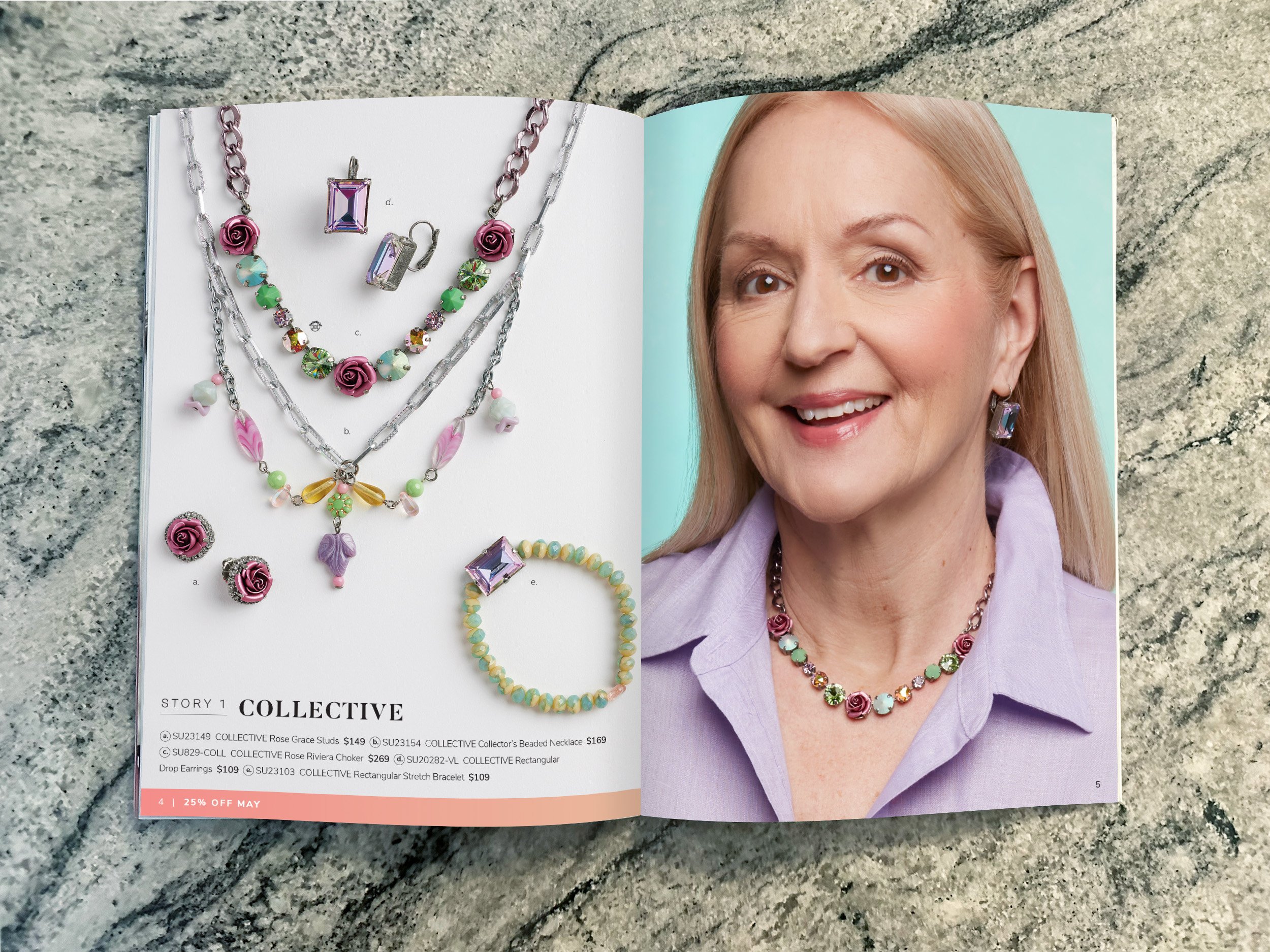
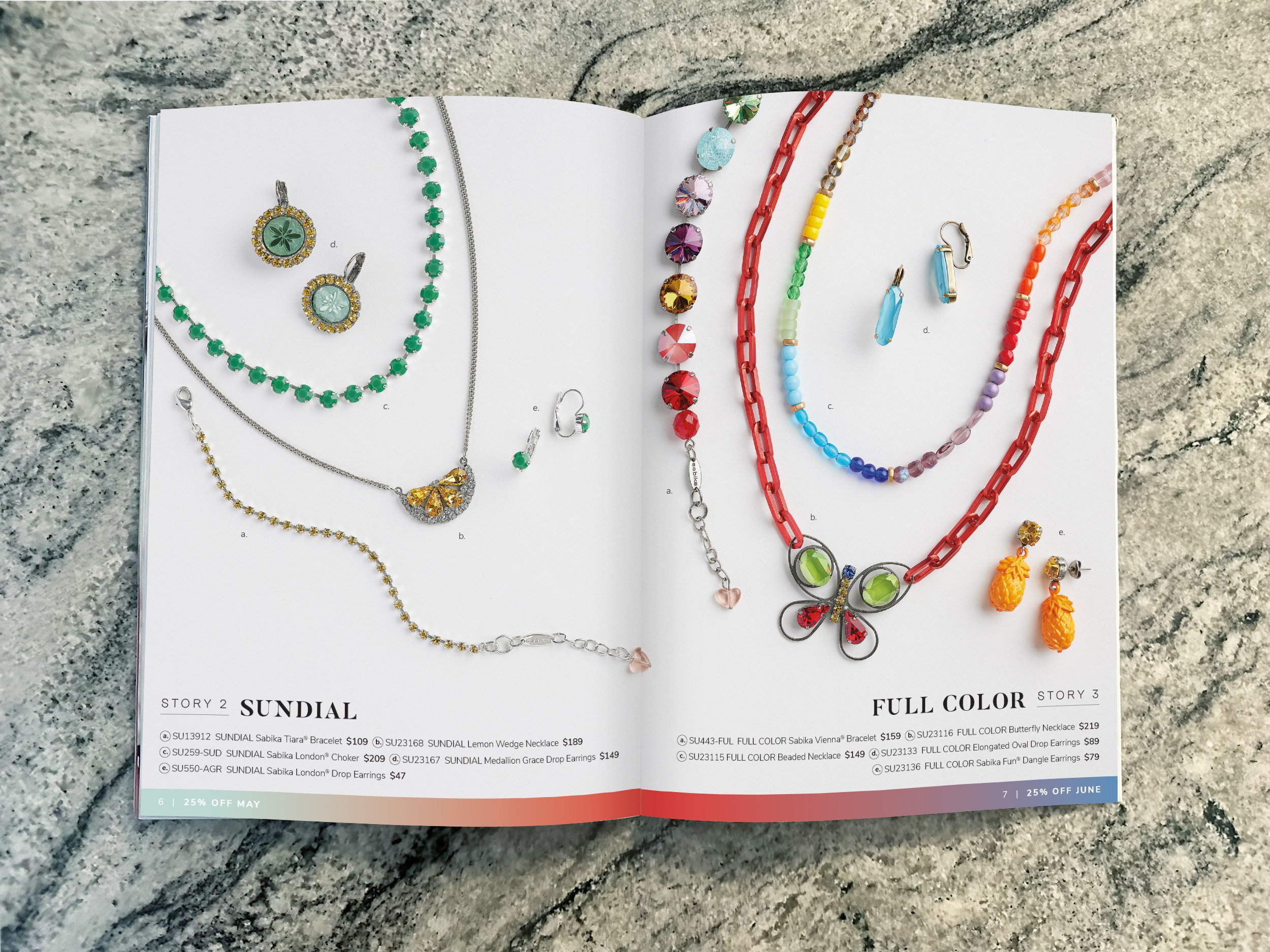
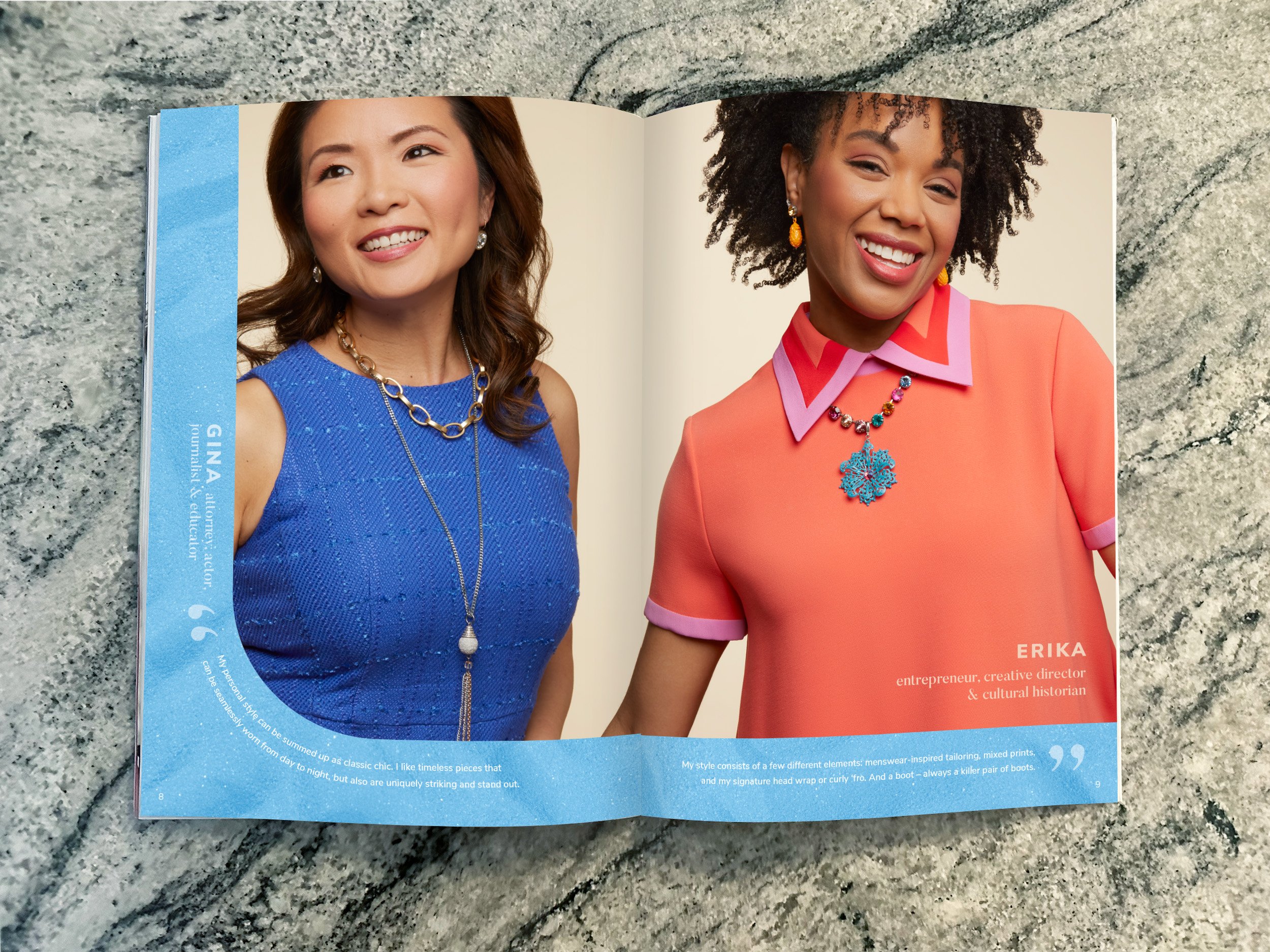
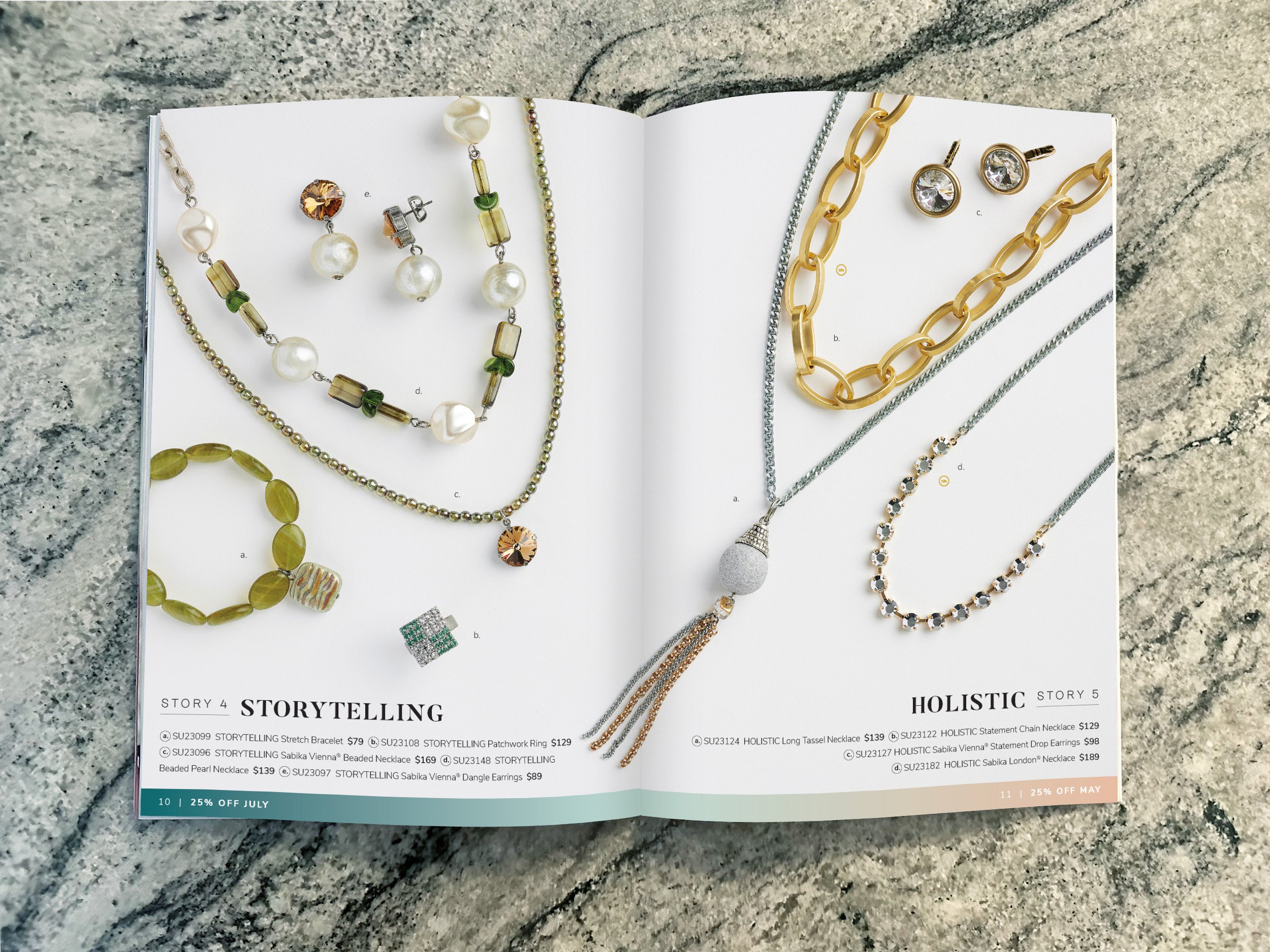
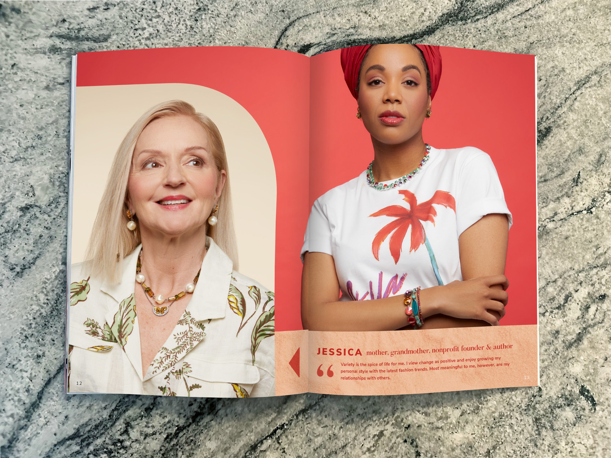
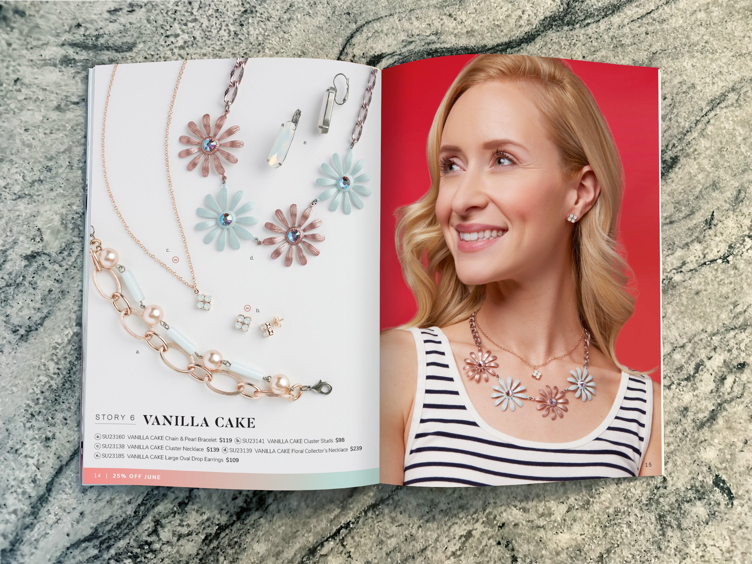
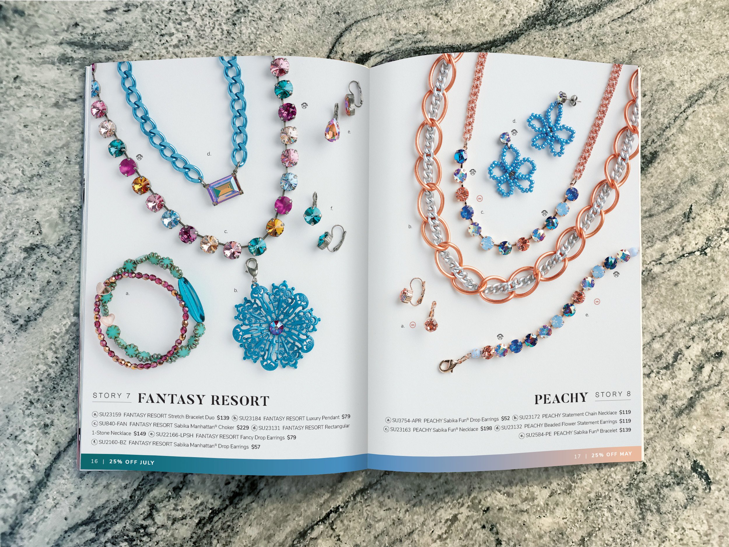
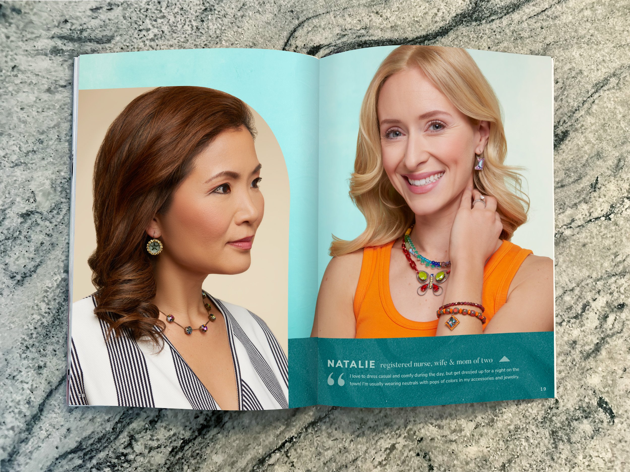
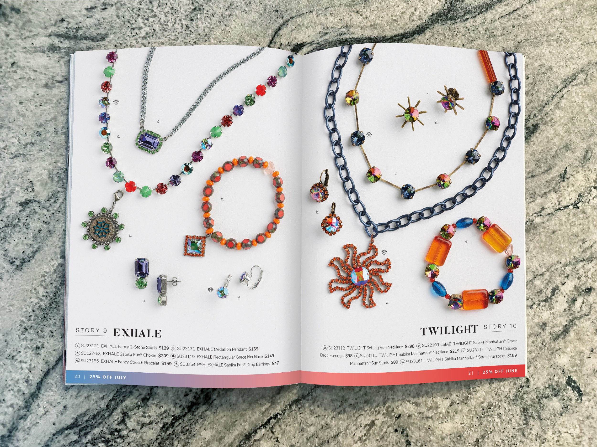
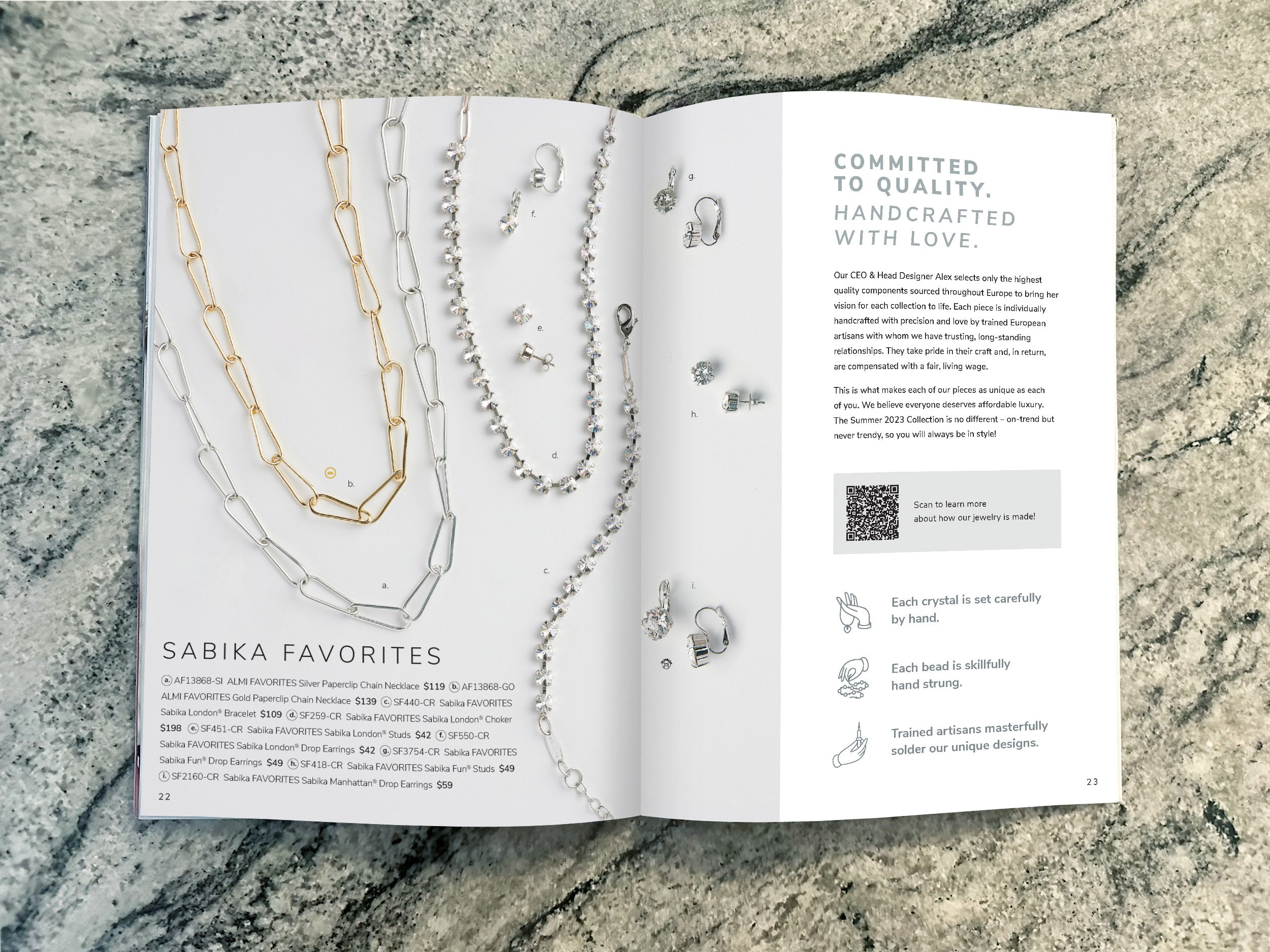
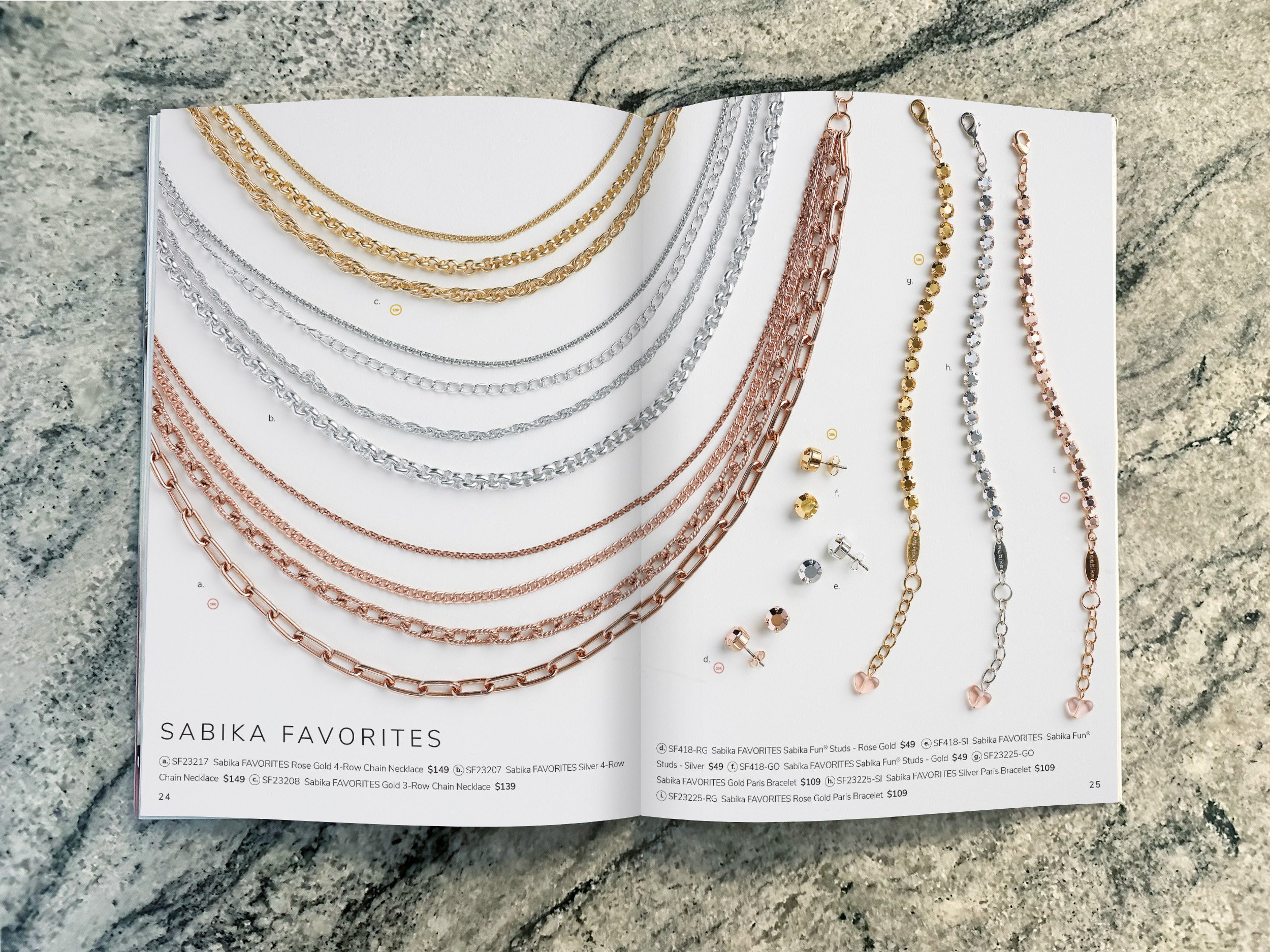
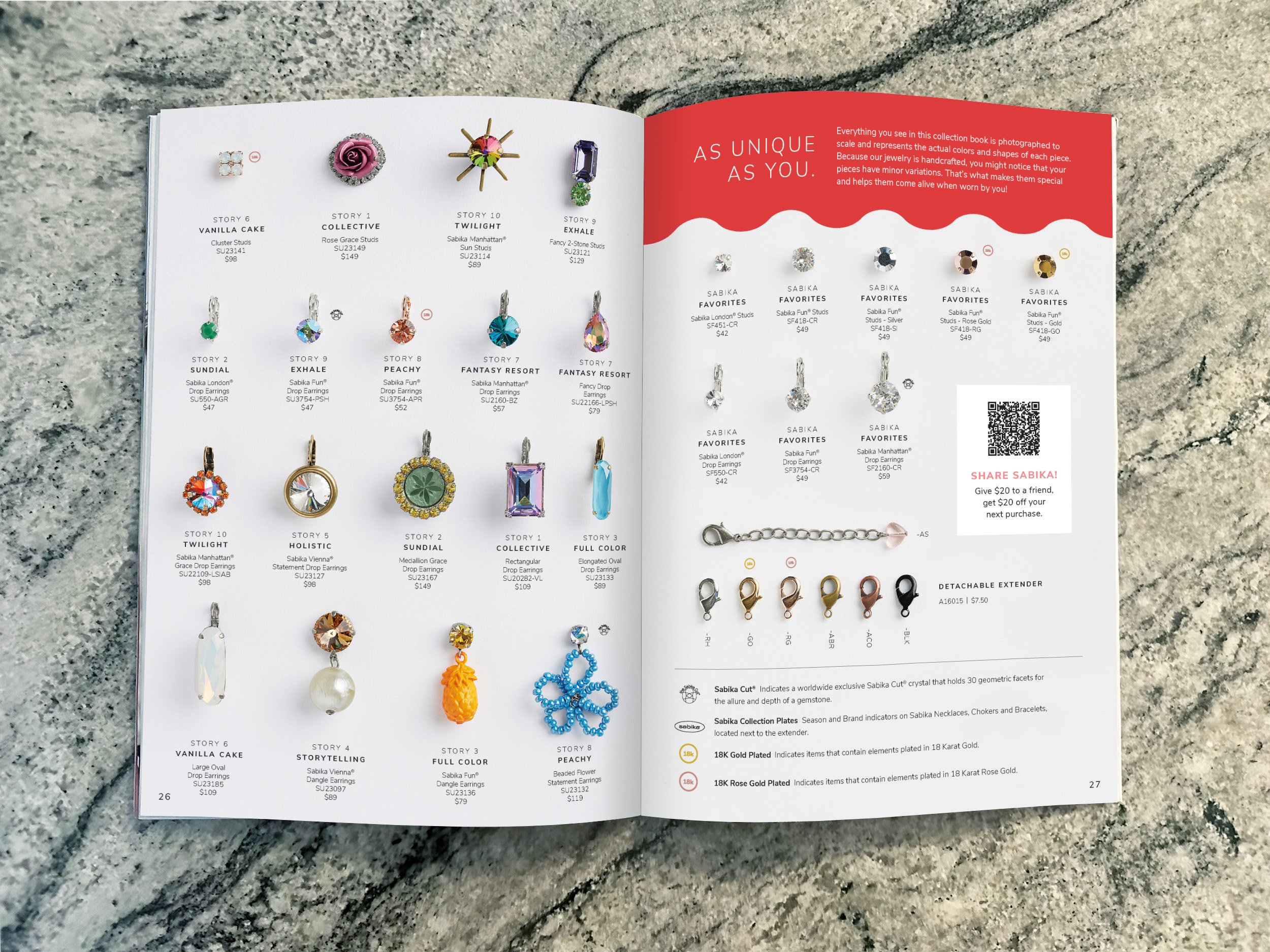
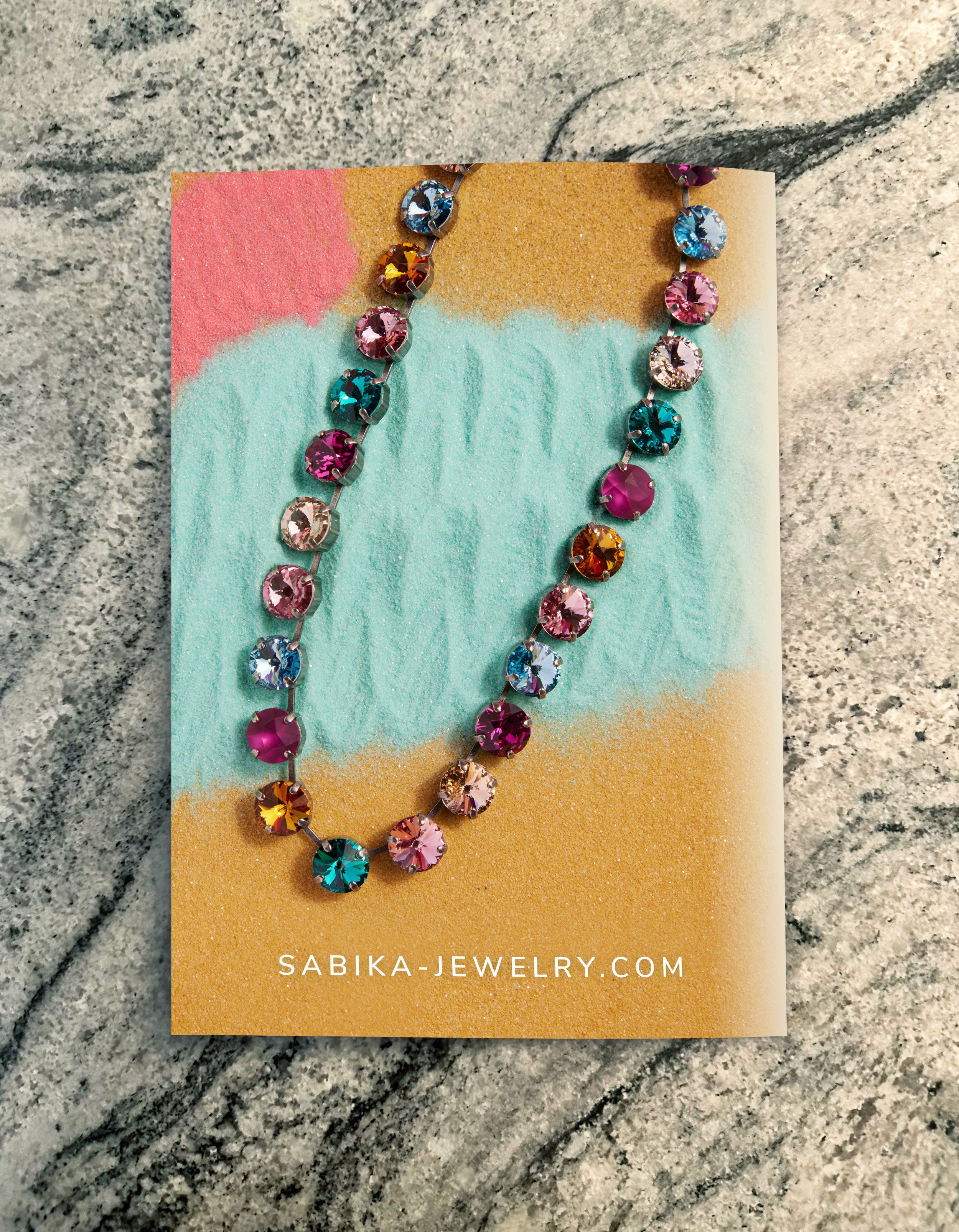
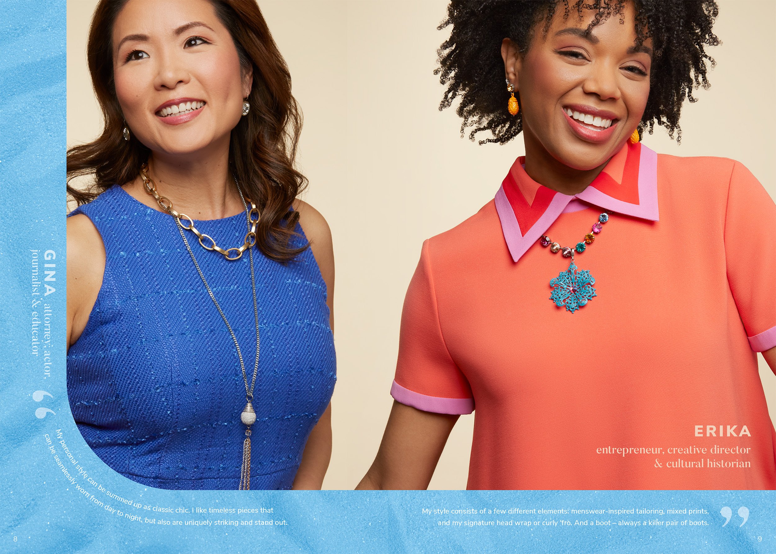
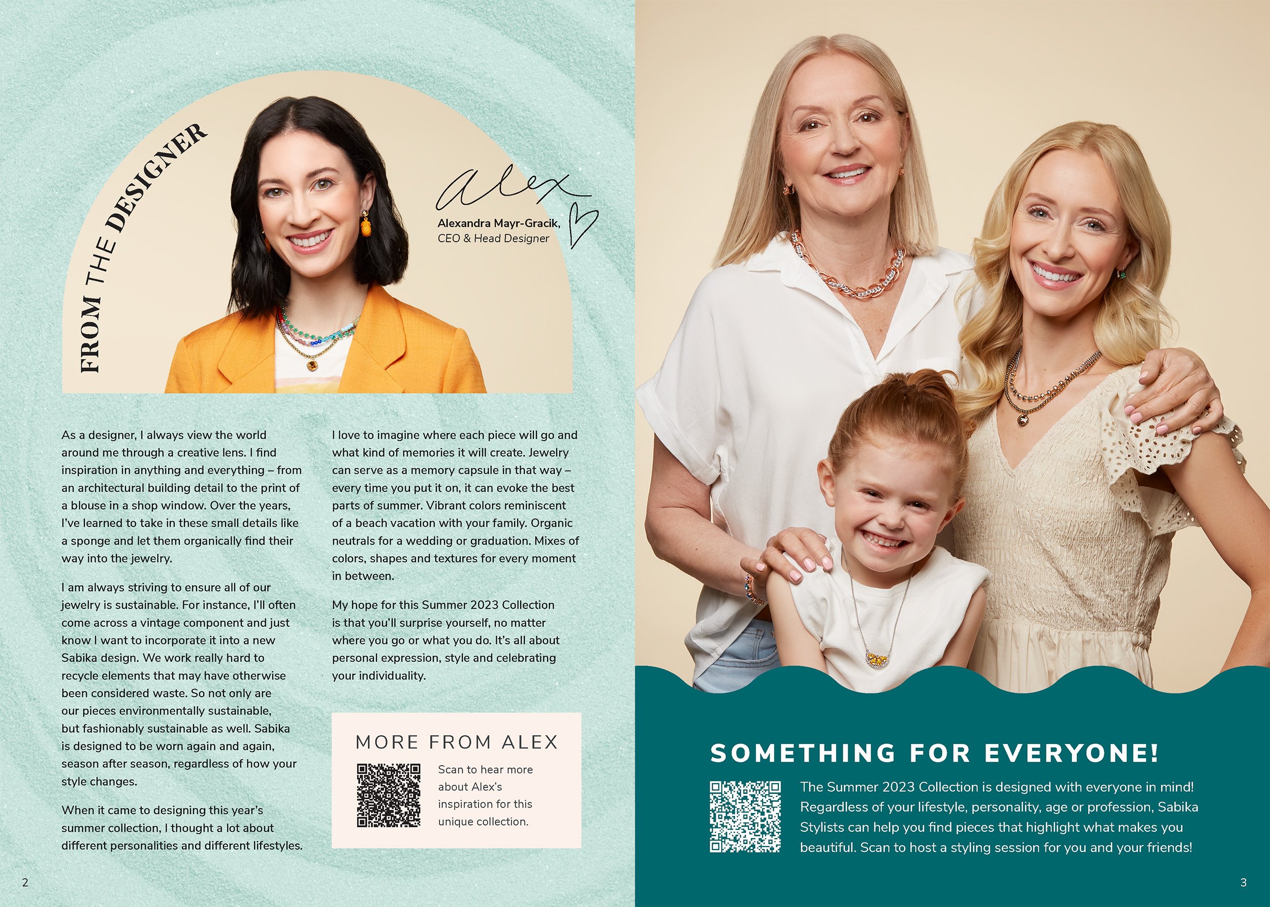
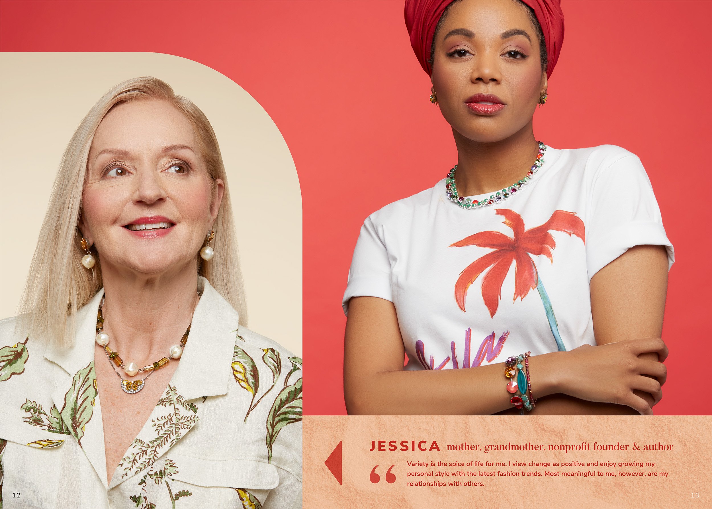
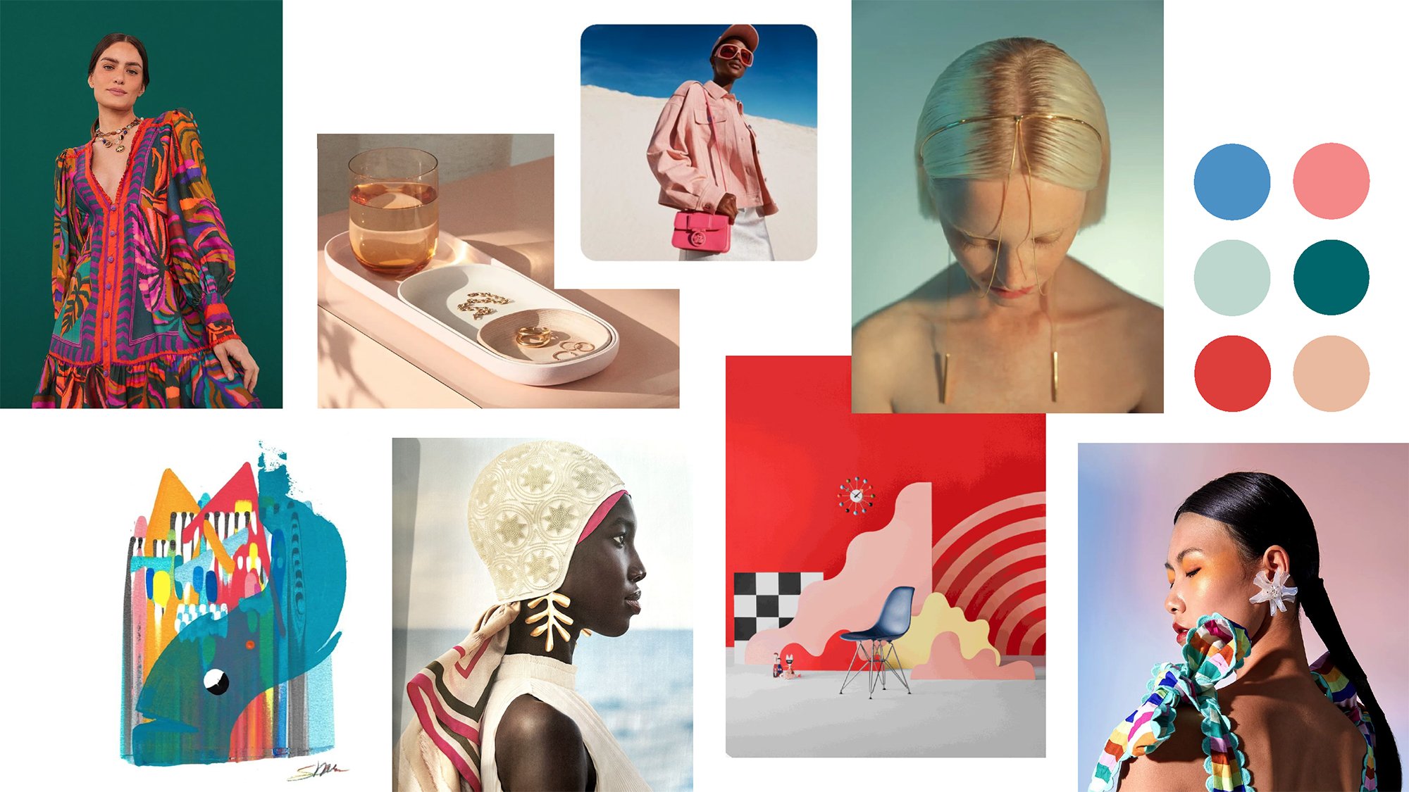
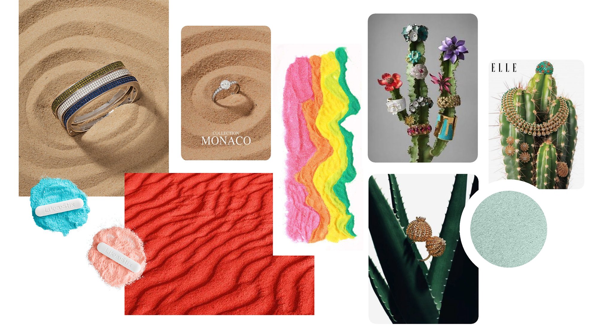
Each season, Sabika launches a new 10-look jewelry collection. Each collection calls for branding that’s distinctive from past seasons. For summer, I started by hearing the jewelry designer’s inspiration & process, & reviewed that season’s trend reports & finished pieces. From there, I built a cohesive color palette & mood boards for the collection photoshoots - covering everything from look & feel, to model shots & fresh product laydowns. The collection branding then extended to the logo & enticing print lookbook. The summer jewelry was big, bold & playful, which translated to clean curves & arches, bright gradients & timeless typography.
Mood board, color palette, summer logo & collection book design & layout by Laura Shirley. Sabika logo & photography by Sabika.
Color Palette & Mood Boards:
Logos:


Booklet: